

What Solid Glass does
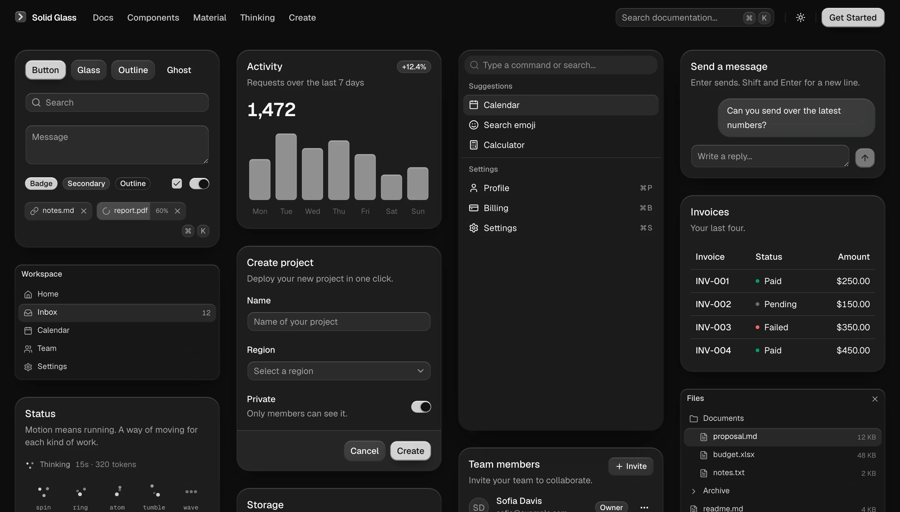
Solid Glass is a visual theme for shadcn/ui, designed for industrial AI panels, operator consoles, and dashboards. It gives interfaces thick, smoky panes that look solid from a distance and reveal their glass character mainly at the edges.
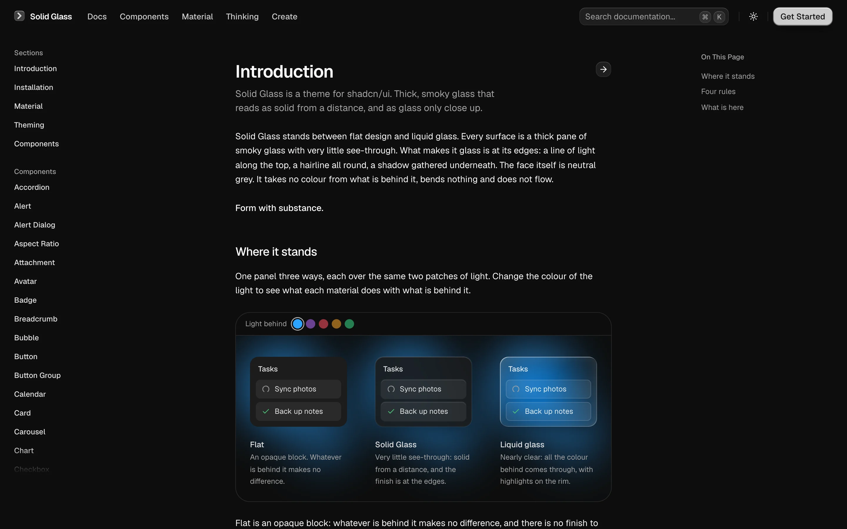
Unlike liquid-glass effects, Solid Glass does not make the background compete with text. Its face uses a neutral grey surface that does not bend, flow, or take color from the content behind it. The finish comes from a light line along the top, a fine border, and a shadow beneath the surface.
The project includes the shadcn/ui component set and a collection of components for interfaces where an AI agent is working. The official Solid Glass site displays the material across the available components and includes a Create page for adjusting its visual variables.
Key features and components
- A single stylesheet applies the theme to shadcn/ui components by using their existing
data-slotattributes and classes. - The theme defines shadcn/ui's variable names, including three glass thicknesses, colors, motion, and its single visual state.
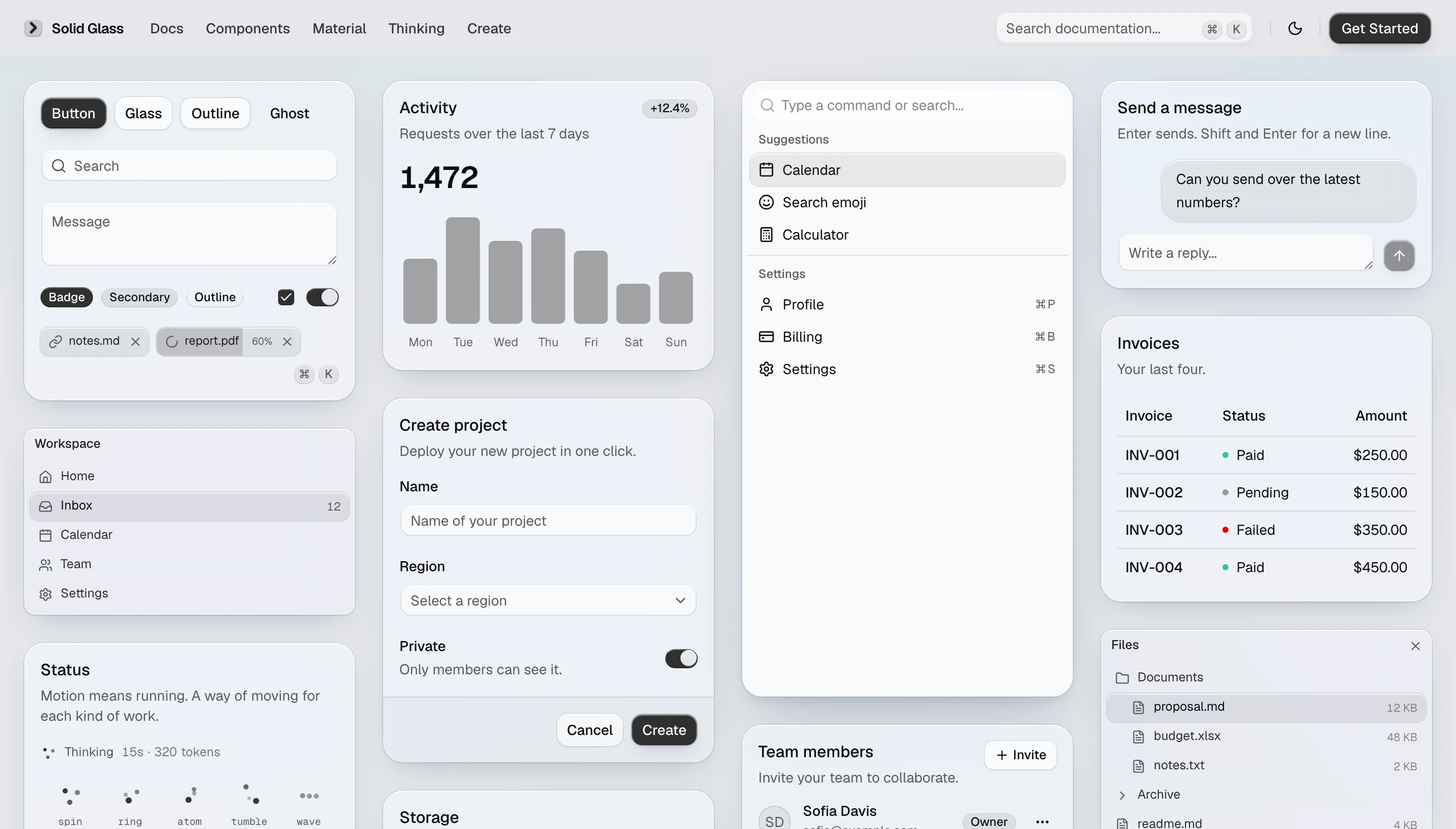
- Dark mode is the primary material design, with a light theme also available.
- The Create page lets you adjust thickness, tint, chart color, type, radius, rim, and blur, then copy the resulting CSS.
- The registry provides installable Solid Glass components through the shadcn CLI.
Solid Glass's own components include status-glyph, panel, tag, and dot-loader. Agent-oriented components include turn-status, composer, tool-steps, diff-view, ask-card, context-ring, task-notice, and reasoning.
Install the theme
1. Start with a shadcn/ui project
Use a shadcn/ui project based on React 19, Tailwind CSS 4, and the Base UI components. If you are starting from scratch, initialize it with:
npx shadcn@latest init
2. Add the Solid Glass stylesheet
You can install the stylesheet from the hosted registry or directly from the repository:
npx shadcn@latest add https://deeplethe.github.io/solid-glass/r/solid-glass.json
npx shadcn@latest add deeplethe/solid-glass/solid-glass
3. Import it after the existing styles
Import Solid Glass after Tailwind and shadcn/ui's stylesheet. The theme defines the same color variable names created by shadcn init, so remove the generated :root and .dark color-variable blocks before adding the import.
@import "tailwindcss";
@import "tw-animate-css";
@import "shadcn/tailwind.css";
@import "./solid-glass.css";
After this import, your existing shadcn/ui components can use the material without component changes. For the complete installation guidance, see the Solid Glass installation page.
Install Solid Glass components
Solid Glass's own components use the same shadcn registry workflow. For example, install the status indicator with:
npx shadcn@latest add https://deeplethe.github.io/solid-glass/r/status-glyph.jsonRepeat the command with the registry URL for another component. The available registry entries cover status displays, panels, labels, loading indicators, agent turn information, composition areas, tool steps, diffs, questions, context usage, task notices, and reasoning views.
Run the project locally
To work on the Solid Glass showcase or inspect its source, clone the repository, install dependencies, and start the development server:
npm install
npm run dev
The development site runs at http://localhost:5191. Production and verification commands are:
npm run build
npm run typecheck
The build writes the production output to dist/.
Explore the development tools
The repository includes development-only routes that help you inspect the theme and examples:
/dev/bannerdisplays the development banner used by the project./dev/examplesmounts every example and reports examples that fail./dev/examples?q=button,cardfilters the examples shown./dev/examples?theme=lightpreviews examples in the light theme./dev/examples?hover=<selector>shows a matching element as if the pointer were over it./dev/examples?click=<selector>presses a matching element so you can inspect what it opens.
When deploying the site outside the repository's default GitHub Pages location, set SOLID_GLASS_ORIGIN to the address where the site is served and SOLID_GLASS_BASE to its path. Solid Glass components use the origin when referring to one another.
Understand the project structure
The most important files and directories are:
src/solid-glass.csscontains the complete material theme.registry.jsondescribes what the shadcn CLI installs. The registry build also createspublic/r/for the site.src/components/ui/contains the displayed shadcn/ui and Solid Glass components.src/create/andsrc/pages/create.tsximplement the material customization page.src/examples/contains one small file per example.content/stores component and project documentation.scripts/build-docs.mjsconverts the documentation intosrc/docs/generated.json.
Create a Solid Glass component
To add a component of your own, follow the same organization used by the project:
- Create
src/components/ui/<name>.tsx. Write it like a shadcn/ui component, use function components, add adata-slotto every part, and usecn()from@/lib/utils. - Add
src/examples/<name>-demo.tsx, along with one file for each additional example. - Create
content/solid/<name>.mdx. Include front matter with a title and description, a component preview, installation instructions, usage instructions, and a heading for each example.
Keep the material consistent with its four design rules: the finish belongs at the edge, surfaces should feel heavy rather than airy, depth is expressed through thickness, and the interface uses one state.
Advanced customization with the Create page
Open the Create page to tune the material interactively. Adjust the thickness, tint, chart color, type, radius, rim, and blur while the preview updates. Once the result fits your interface, copy the small CSS output and adapt the relevant variables in your project stylesheet.
The available choices are defined in src/create/options.ts, while the preview cards use shadcn/ui components. This makes the page useful both as a design tool and as a reference for how the theme variables affect the material.
Conclusion
Solid Glass is a low-friction way to give an existing shadcn/ui application a substantial, readable glass aesthetic. Install its stylesheet after your normal theme files, add agent-focused components from the registry when needed, and use the local examples or Create page to refine the result. The project is released under the MIT License; components and documentation originating from shadcn/ui remain under their authors' MIT License as noted in NOTICE.md.