
AI Tutorial · Visual Quality Series
Z-Image-Turbo works, but your images look too plastic? After tuning for half a month, I finally figured out how to get that cinematic poster look
Same workflow, same model: other people get theatrical posters, while yours look like Taobao product pages. The problem isn’t the model—it’s that you don’t know what “good” looks like.
#ComfyUI#ZImageTurbo#AIImageGeneration#MoviePoster#AdvancedPromptingAI-assisted production note: AI helped organize the structure and layout of this article. All failed tuning attempts, specific parameter adjustments, and judgments about visual quality are real records of my hands-on work in local ComfyUI. All tools are for personal learning only, not for commercial use or bulk content production.
◆ ◆ ◆
In my previous article, I covered how to get the basic Z-Image-Turbo workflow running, how to set the parameters, and which pitfalls to avoid.
Once it worked, I was genuinely thrilled for a while.
Click Generate and get a 1024×1024 image in 10 seconds. My 4060 ran it smoothly, and watching the ComfyUI interface churn out images made me very happy.
But I soon noticed a problem that really bothered me.
How should I put it… you could tell at a glance that the images were made by AI.
It felt like buying a new outfit, thinking it looked great, then stepping outside and realizing everyone was wearing the same thing—you instantly didn’t want to wear it anymore.
AI images are the same: overly smooth, lighting that looks like a flat LED panel, and compositions that are hard to identify as wrong but somehow feel awkward.
Put simply, they had a “plastic look.”
The model wasn’t the problem. I just didn’t know how to use it.
Over the next half month, I repeatedly tuned one image through more than 30 versions and finally began to understand the method. Today I’m sharing all the failures and lessons learned.
◆ ◆ ◆
Let me be honest first: how embarrassing my first “advanced” image was
After getting the beginner workflow running, I became overconfident.
The basic parameters were correct, right? So why not just use an advanced prompt? I piled on everything: movie poster, cinematic lighting, 8K, masterpiece.
And the result?
Here’s a real example: I wanted to make a sci-fi movie poster. My prompt was:
A epic sci-fi movie poster, futuristic city, giant spaceship,
neon lights, cinematic lighting, masterpiece, 8K, ultra detailed
I clicked Generate, and the image appeared in about 10 seconds:
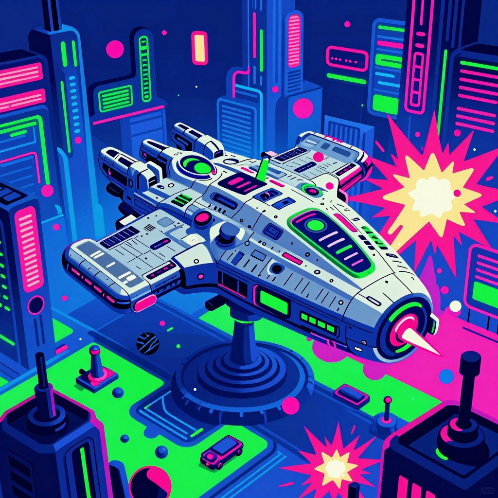
▲ Failed version: piled-up elements, harsh colors, flat lighting—the classic “AI plastic look”
Honestly, I stared at the image in silence for about ten seconds.
This wasn’t a sci-fi movie poster. It was a game cover made for 100 yuan by someone hired on Taobao.
Looking back, I found three fatal problems:
- The prompt was too greedy. I stuffed “futuristic city + giant spaceship + neon lights” into one image. The elements piled up, and the model had no idea what the focus was.
- The colors weren’t controlled. I gave no direction for the palette, so Z-Image-Turbo defaulted to a color scheme that was “vivid but cheap.”
- The lighting wasn’t defined. I only said “cinematic lighting,” without specifying the light direction, lighting ratio, or shadow depth.
Without solving these three problems, even the best model won’t produce a cinematic look.
◆ ◆ ◆
One thing it took me half a month to understand
The question isn’t whether the model can create good images—it’s whether you know what “good” means.
That may sound abstract, so let me put it plainly:
Ask someone who has never seen a movie poster to design one. Can they do it? No. Their mind has no reference library for what a “movie poster should look like.”
AI image generation works the same way. If you don’t have a clear standard for a “good image” in your head, your prompt won’t hit the mark.
So during this half month, I wasn’t tuning parameters. I was building my own aesthetic standards.
I did three things:
- I revisited the more than 200 movie posters I had saved on Pinterest and analyzed them one by one
- I broke each image down into three dimensions: color, composition, and lighting
- I tested repeatedly with Z-Image-Turbo, changing only one dimension each time to see the effect
Was it tiring? Yes. Was it worth it? Absolutely.
Here are the three core standards I refined image by image.
◆ ◆ ◆
To get a cinematic look, first nail these three things
First: Color palette—don’t let AI choose your colors
This is the easiest thing to overlook, and also the most fatal.
Z-Image-Turbo is smart, but when it comes to choosing colors, its taste is extremely mainstream.
What does “mainstream” mean? High saturation, high contrast, vivid and harsh—because images like that get the highest click-through rates in the training data.
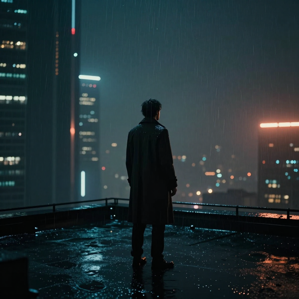
▲ Low-saturation cinematic gray tones: deep blue shadows + soft cyan ambient light, in the style of Blade Runner 2049
But movie posters are never like that. Look at any theatrical poster:
- Sci-fi: cool blue + deep gray + faint neon, as if the image were submerged in ice water
- Chinese-style films: blue-ink tones + plain gray + soft, elegant light, like an ink painting spreading outward
- Urban films: low-saturation night scenes + warm orange points of light, like a streetlamp on a rainy night
What do they have in common? Low saturation.
It’s not a lack of color. The colors simply aren’t harsh or distracting, and the image has room to breathe.
My current approach is to state the color direction clearly in the prompt:
Bad (too vague):
cinematic lighting, masterpiece

Good (specific):
muted desaturated color palette, deep navy blue shadows,
soft cyan ambient light, no bright saturated colors,
film grain texture, cinematic color grading like Blade Runner 2049
With the same workflow, adding a color description completely changed the visual quality.
A pitfall I encountered: The first time I wrote “low saturation,” the image came out gray and hazy, like it had faded. Only after changing it to “muted cool tones with subtle color depth” did the result improve.
See? Not a single word in a prompt can be chosen carelessly.
◆ ◆ ◆
Second: Composition—don’t let the model improvise
Z-Image-Turbo has a problem with composition: it likes to place the subject right in the center and fill the surrounding space with details.
Technically, there’s nothing wrong with that. Aesthetically, though, it looks too much like a default template.
Real movie posters use logical compositions:
- Rule of thirds: place the subject around one-third of the frame and leave breathing room
- Central focus: the person is centered, but the background has depth rather than looking pasted on
- Golden negative space: leave empty areas instead of filling every corner
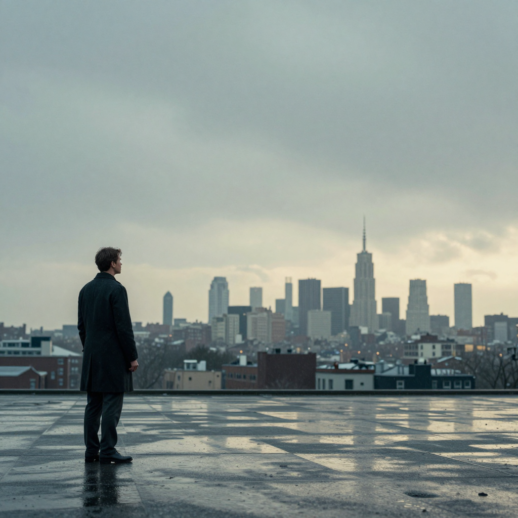
▲ Rule-of-thirds composition: the subject is on the left third, leaving the right side largely empty for the city skyline
I control it in the prompt like this:
Bad:
beautiful composition

Good:
rule of thirds composition, subject placed on left third line,
generous negative space on the right,
shallow depth of field focusing on subject,
clean and uncluttered background, professional poster layout
A pitfall I encountered: Once I wrote “minimalist composition,” and the model interpreted it as “there’s nothing in the image,” giving me a solid-color background. After changing it to “clean composition with intentional negative space,” the result became normal.
◆ ◆ ◆
Third: Lighting—don’t make the image look like a flat LED panel
This is the most crucial step in going from an “AI look” to a “cinematic look.”
Lighting in ordinary AI-generated images resembles a uniform LED panel: everything is bright, with no contrast between light and dark and no sense of volume.
But lighting in movie posters has “volume”:
- God rays: light passes through windows or clouds, making the beams visible
- Backlit rim light: light behind the subject makes the edges glow
- Layered light and shadow: highlights aren’t harsh, shadows aren’t crushed, and there are transitions in between
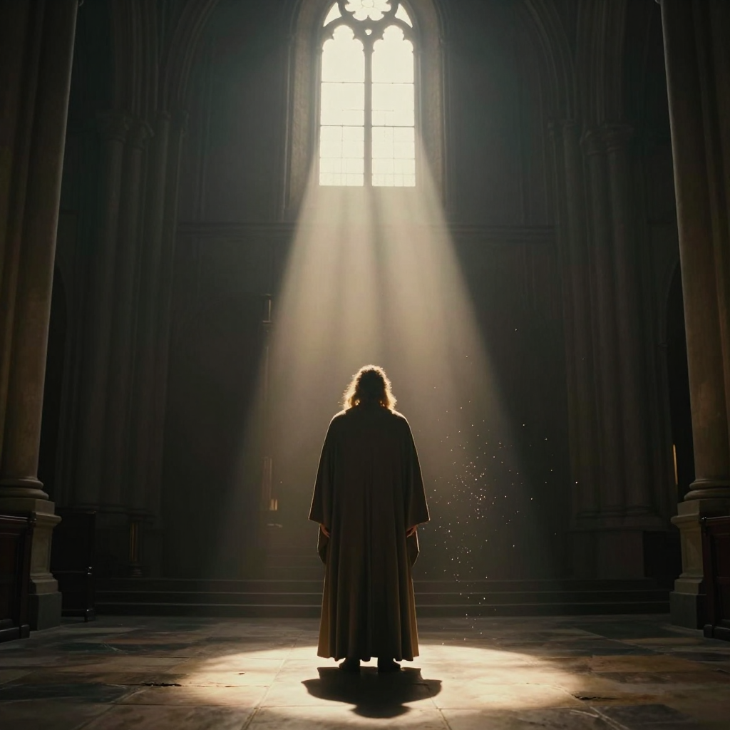
▲ Volumetric lighting: god rays pass through the mist, while golden rim light outlines the character’s silhouette
Here’s how I write the lighting portion of my prompts now:
Bad:
good lighting

Good:
volumetric lighting with visible light rays,
rim light creating a subtle glow around the subject's silhouette,
soft shadows with detail in the dark areas (not crushed blacks),
god rays filtering through the scene, atmospheric haze
A pitfall I encountered: At first I wrote “dramatic lighting,” and the model gave me a stage spotlight, with half the face lit and half in shadow—like a horror movie. After changing it to “soft cinematic volumetric lighting, gradual shadow falloff,” the result finally looked right.
◆ ◆ ◆
How I tuned three different scenes
Scene One: Epic sci-fi—focus on “cold” and “large”
This is the direction I spent the most time on, and it’s also the easiest to get wrong.
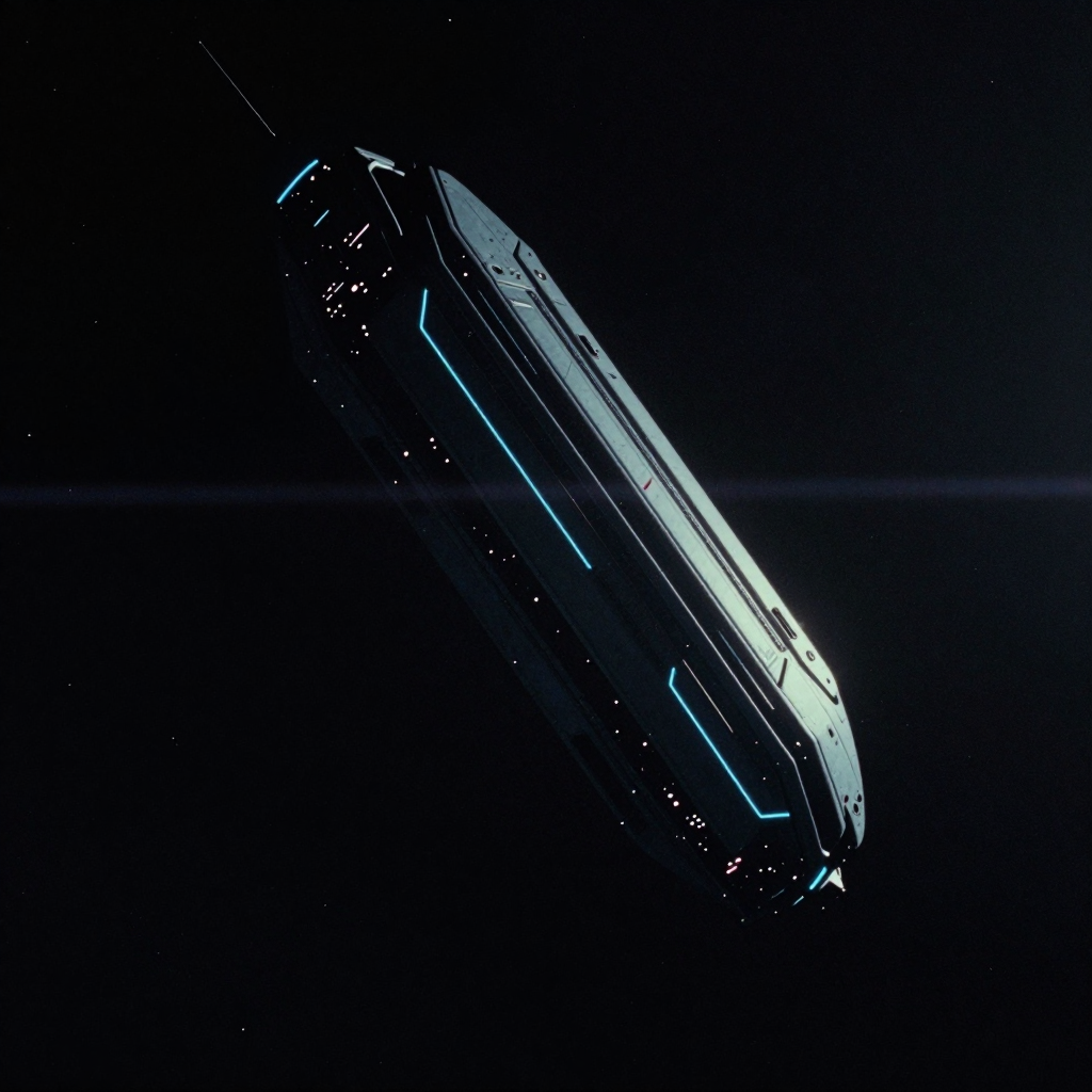
▲ Epic sci-fi: deep space + massive structure + cool blue palette + faint dust
Key points:
- Color: deep blue + star gray, with a touch of faint neon, but not the vivid cyberpunk look
- Composition: open and grand, with the subject occupying around 30% of the frame and ample negative space for the cosmos
- Lighting: backlight + volumetric light, creating a sense of depth, as if there were light in the distance
My prompt keywords:
deep space background, massive monolithic structure,
cold navy blue and steel gray tones, subtle cyan rim light,
atmospheric dust particles floating in zero gravity,
cinematic anamorphic lens flare, widescreen 2.35:1 composition
Failure log: Once I wrote “stars and galaxies,” and the model gave me a pile of colorful nebulae that looked like a Windows XP desktop wallpaper. Only after changing it to “deep space void with subtle distant starlight” did I get that profound sense of emptiness.
◆ ◆ ◆
Scene Two: Chinese xianxia style—focus on “soft” and “empty”
This was the direction that surprised me most. Z-Image-Turbo actually understands Eastern aesthetics fairly well—the key is giving it the right guidance.
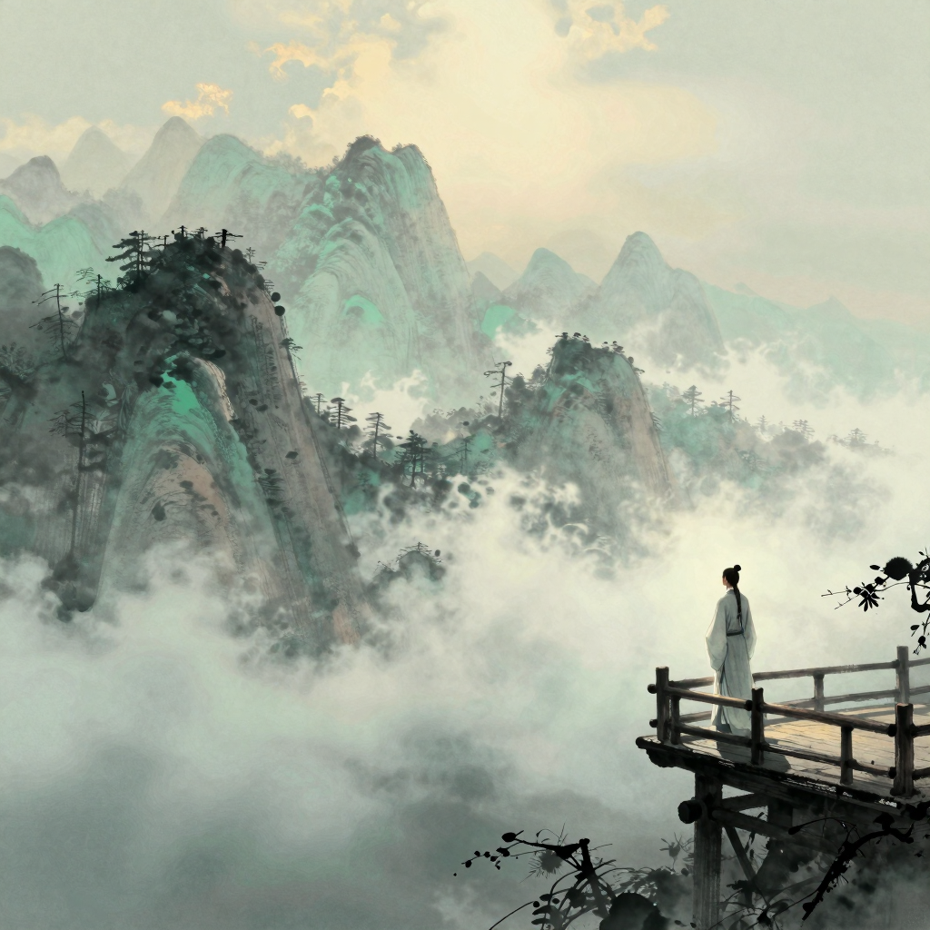
▲ Chinese xianxia style: blue-ink landscapes + sea of clouds + soft, elegant light + abundant negative space
Key points:
- Color: blue-ink tones + plain gray + soft, pale gold light; avoid the traditional bright red-and-green palette
- Composition: negative space is the soul. Place the subject slightly low or to one side, with large areas of clouds, mountains, and sky
- Lighting: soft, diffused light without harsh contrast, like light in the mist at dawn
My prompt keywords:
traditional Chinese ink wash painting aesthetic,
misty mountain peaks disappearing into clouds,
soft celadon green and warm grey tones,
diffused morning light through fog,
scholar viewing the landscape from a pavilion,
ethereal atmosphere, negative space on the upper half, poetic mood
Failure log: The first time I wrote “Chinese fantasy movie poster,” the model gave me an online-game ad—golden armor, wings, and flying swords everywhere. Only after explicitly writing “classical ink painting style, not fantasy game art” did I bring the visual style back under control.
◆ ◆ ◆
Scene Three: Urban mood—focus on “dark” and “close”
This direction is ideal for emotional expression and is currently the one I use most often for my public-account covers.
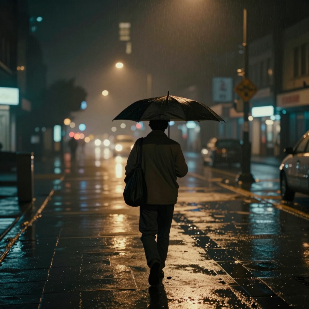
▲ Urban mood: rainy night street + warm amber streetlight glow + shallow depth of field + Wong Kar-wai-inspired color grading
Key points:
- Color: low-saturation night scenes + warm orange neon accents, like the look of a Wong Kar-wai film
- Composition: tight, with depth of field: blurred foreground + subject in the midground + city lights in the distance
- Lighting: mainly point sources—neon, streetlights, and window light; avoid broad, uniform illumination
My prompt keywords:
rainy night city street, warm amber streetlights reflecting on wet pavement,
shallow depth of field, subject silhouette against blurred city lights,
moody and atmospheric, Wong Kar-wai inspired color grading,
soft bokeh effect in the background, intimate and contemplative mood
Failure log: Whenever I wrote “rainy night,” the model loved adding a transparent umbrella. Almost every image had one. Adding “no umbrella, rain on the character's coat” finally removed it.
◆ ◆ ◆
My painful tuning history, explained plainly
Don’t think prompts alone are enough. If certain parameters are wrong, even the best prompt won’t help.
Steps—not more is always better
Z-Image-Turbo defaults to 8 steps. I tested 4, 8, 12, and 20 steps.
Conclusion: 8 steps is the best balance between performance and quality. Above 12 steps, the improvement in visual detail is barely noticeable to the naked eye, but generation time doubles. On my Windows 11 + RTX 4060 (8G VRAM) + 64G RAM setup, 8 steps takes a little over 10 seconds, while 20 steps takes longer. Honestly, it isn’t necessary.
CFG—don’t touch it, or everything falls apart
Z-Image-Turbo’s CFG must be fixed at 1. Don’t ask why—I tried setting it to 3, and the resulting image looked like it had been splashed with fluorescent powder. I mentioned this in the beginner guide, but I’ll emphasize it again.
Sampling shift—I set it to 3.5
AuraFlow’s default shift value is 3. I tried 2, 3, 3.5, and 5.
- 2: the image is darker, with lost detail in the shadows
- 3: standard, no problems
- 3.5: a slightly brighter image with richer highlight detail—this is my current choice
- 5: overexposed, with the highlights turning completely white
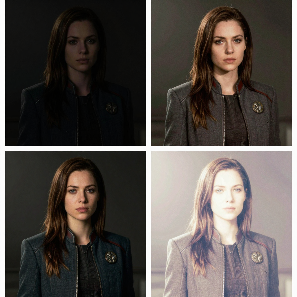
▲ Shift parameter comparison: brightness and detail at different values
This parameter isn’t fixed; it depends on what your image needs. For a dark night scene, a lower shift feels more appropriate. For a bright daytime scene, you can raise the shift slightly.
◆ ◆ ◆
In closing
Half a month ago, I thought “knowing how to use Z-Image-Turbo” meant knowing how to set the parameters and run the workflow.
Now I understand that tools are the foundation, but aesthetic judgment sets the ceiling.
You don’t need to become a professional designer, but you do need to know what “good” means—where the color palette should go, how to use negative space in the composition, and where the light should come from.
There can be no ambiguity in a single word of these three things in your prompt.
If you’re also using Z-Image-Turbo to create images, try this: before clicking Generate, spend half an hour clearly describing the color, composition, and lighting in your prompt.
You’ll find that the same model can produce completely different results.
The structure of this article was organized with AI assistance. All failed tuning attempts, specific parameter adjustments, and judgments about visual quality are real records of my hands-on work in local ComfyUI. The relevant tools are used only for personal learning and hands-on experimentation records, not for commercial use or bulk content production.