

Prompt
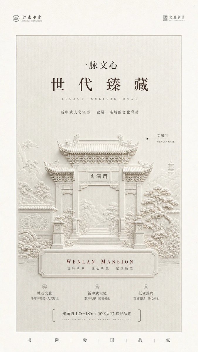
Build a restrained, monumental brand narrative around any specific subject: broad, clean paper negative space surrounding an inset light textured panel, stably arranged along a central axis, with light information above and solid visual weight below. The reading sequence should move from miniature signatures in the two corners into the central title, then down to the thematic relief that carries the primary visual weight, and finally resolve with sparse information at the bottom. Distill the subject’s most recognizable object into a frontal, nearly symmetrical, monochrome light bas-relief, preserving a clear overall silhouette, layered receding structures, repeated details, and a few miniature narrative motifs. Let the relief grow upward from the lower half of the panel, approaching the edges in places without pressing against the outer frame. The material should resemble finely textured paper pulp, plaster, or impressed clay, with low reflectivity and diffuse shading. Soft light from the upper side should leave only an extremely subtle highlight along raised edges and create thin warm-gray shadows in grooves and contact areas, allowing complex details to emerge through real changes in depth rather than painted outlines. Place the central title within a large area of quiet negative space, using high-contrast Chinese serif lettering with a traditional structure and modern restraint. Make the first line moderately sized and tightly grouped; enlarge the second line significantly and open the letter spacing to create a solemn pause. Beneath the title, add a very small English subline with wide tracking, followed by a finer Chinese explanatory line connecting the text area to the relief area. A small dot and fine horizontal leader line may label the relief’s identity, with Chinese above and English below. Embed a larger English brand line and a Chinese values statement into the relief base; keep the lettering visibly flat and printed, creating a slight contrast in depth against the sculpted surface. Place miniature marks of similar visual weight in the two upper corners of the outer paper area. At the bottom, use fine-line brackets to frame a short note and delicate English text; at the very bottom, spread short characters widely to create a calm, ceremonial ending. Derive color roles from the subject’s semantic palette and map them into related variations: use a very light, low-saturation material layer approaching the subject’s primary color across most of the composition; keep the supporting base color at a subtle warm or cool distance with extremely low contrast; use a low-saturation dark tone for body text to ensure clarity; reserve a small amount of a deeper, more distilled thematic accent color for key titles and base copy. Maintain high brightness, low chroma, soft warmth, and optical cleanliness throughout; the accent color must not spread into large blocks. The paper should show fine vertical fibers, slight embossing, and very small natural mottling. Concentrate the texture in the inset panel so it subtly rises and falls with the light, while keeping the surrounding negative space smoother and cleaner. Do not add a uniform yellow-brown filter, heavy grain, or stains. The final result should make the typography, negative space, relief, and paper feel like one carefully impressed, collectible communication artifact. If the relief loses its low-contrast volume, the title fills the space, the colors become stronger, or decoration increases, the quiet and solemn sense of historical reflection will be broken.
——————
Theme: Key visual for an urban renewal exhibition, presenting a commemorative architectural image of an old neighborhood revitalized
Additional: Add one clear exhibition title and a small amount of date and location information
Aspect ratio: Portrait 9:16